
013: UI Quality
How to ensure that your digital products are high quality.

Over the last 3 months, I’ve started obsessing over UI quality. Upholding a high bar for UI quality means sweating the tiny details that often go unnoticed. It’s about being the strict parent and holding your team accountable for every little part of your user experience.
Little fixes in UI quality can make surprisingly big differences in your app’s usage. A weird transition between two screens can disorient your users and can make them unable to complete the task they came to do. Poor contrast in the colors you use can shut out a whole group of users from using your app. Inconsistent typography can make it hard for users to understand the information on the screen and lead to errors & an overall poor impression of your app.
Good UI quality not only makes your product feel professional, it affects the usability of your product. Things like task completion rates and time spent on your apps can be directly tied to your UI quality.
When I talk about UI quality, I’m talking about visual design. The core visual elements I consider when evaluating UI are:
Layout (spacing, alignment, boxes, & borders)
Typography (size, weight, font)
Color (contrast & gradients)
Motion (view transitions & micro interactions)
Let’s use Airbnb to demonstrate some of these elements.
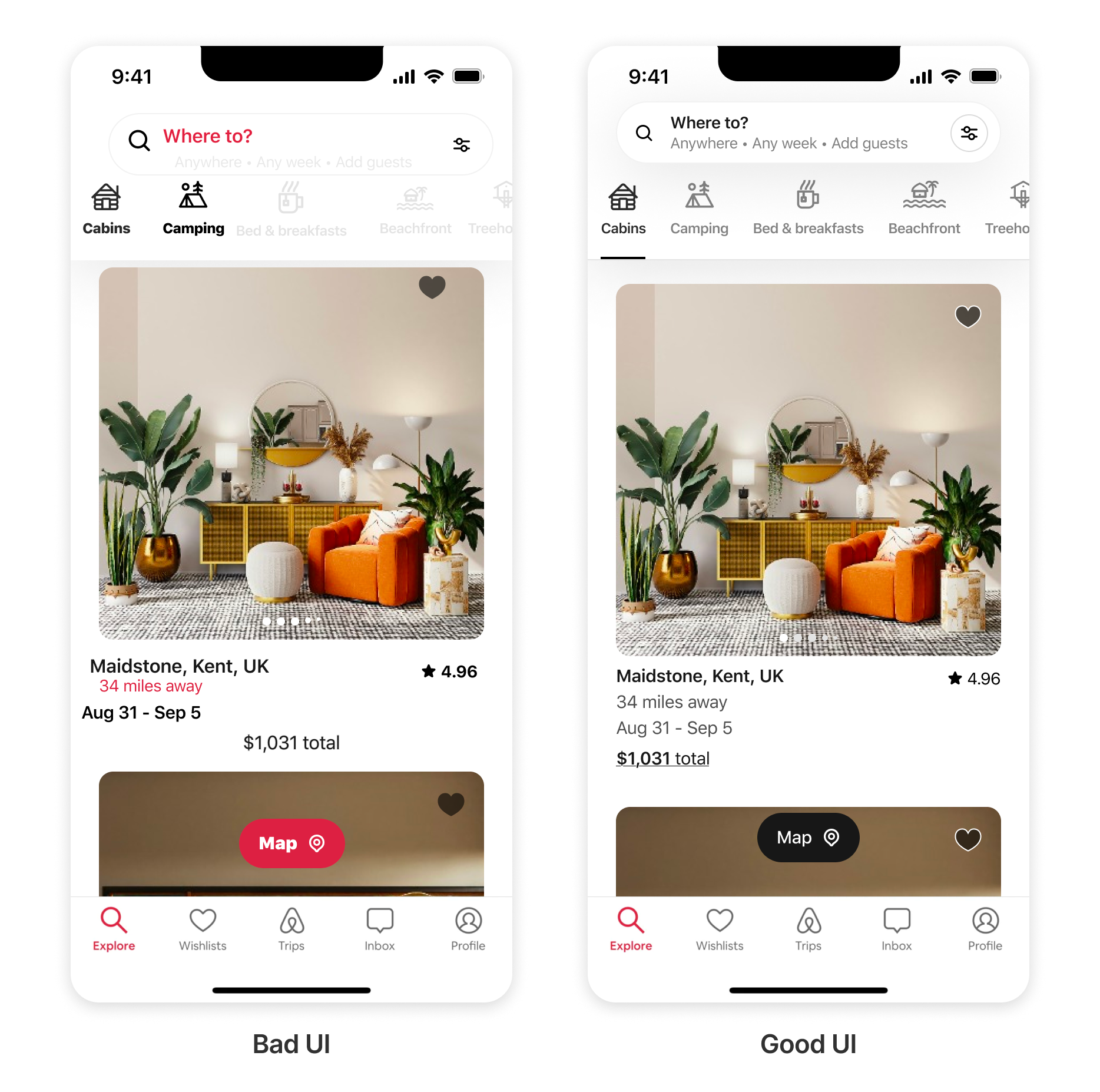
On the left screen, you can see numerous issues:
Poor use of color. We use the red brand color too much which calls attention to too many points on the screen at once. The use of the red brand color on the distance of the first property listing makes it seem like it’s a bad thing. This is because red is often used for error states. The tabs under the search bar are also using inconsistent colors. Both cabins and camping are colored black. Does that mean they are both selected? On the other hand, the remaining tabs are a very light grey, almost unreadable.
Inconsistent typography. There are too many different font sizes and weights in this UI. There are 7 different font sizes and 4 different weights. As a rule of thumb, you should only change the size and weight of a font when you need to communicate levels of importance. For example, I bolded the first two words of this paragraph because it summarizes everything coming after it.
Broken layout. Spacing between elements is inconsistent and nothing is aligned to a grid. Take a look at the text under the first property listing. The location name is further from the left of the screen than the available dates. There’s no point in this and only makes the design look messy.
If you fix all of these issues, you end up with the screen on the right. Do you see how much easier it is to understand what is going on? It also just feels much more polished and professional.
How to ensure your UI is quality.
I mentioned that it’s important to pay attention to the details if you want to make sure your UI is quality. Of course, it’s important to understand visual design. But, the real challenge is making sure the implementation matches the design.
Generally, the designs that you make are already high quality. But many times, the final product doesn’t fully match the design. If this happens, either:
you didn’t explain your design well enough to the engineers building it, or
engineers had to cut corners to get your feature out before a deadline.
The accumulation of these mismatches between implementation and design throughout product development is known as design debt.
It’s best to address design debt before it happens by creating high-quality design specs that leave no room for misunderstanding. But, if it’s too late for that, the best solution is to run a UI audit to document all the existing issues and then work with your team to get the issues fixed one by one. This option is much more difficult and expensive because you will have to convince your team to spend time fixing these small issues instead of pursuing new ideas that might be more immediately impactful.
To stay on top of your UI quality, you’ll need to spend time using the app you are designing. This is known as dogfooding. You spend time using your features to make sure they function as intended.
My month in review.
🏠 Moved into a new apartment with my girl. The new location is fire and is doing wonders for my productivity.
🧱 Started working on a new workstream at Meta.
🎯 Planned out my goals for the year.
⚡️ Led 22 mentorship sessions on ADPlist. I overbooked myself this month. I’m going to ease up a bit in February lol.
Again, another great newsletter that will help me along my journey as a new designer. Can’t wait to read more!
the newsletter is very informational and also caters to a lot of different aspects outside of the UI field. Whether starting a brand or even a layout for what you want your home to feel like, you can use all these points to help maximize your idea. Great work, Jalil.